- 31Aug
A potential customer walking along a busy shopping strip may pass dozens of businesses within a few minutes. A driver has even less time to notice what is around them. Before anyone sees the products inside a store, signage is often the first piece of communication.
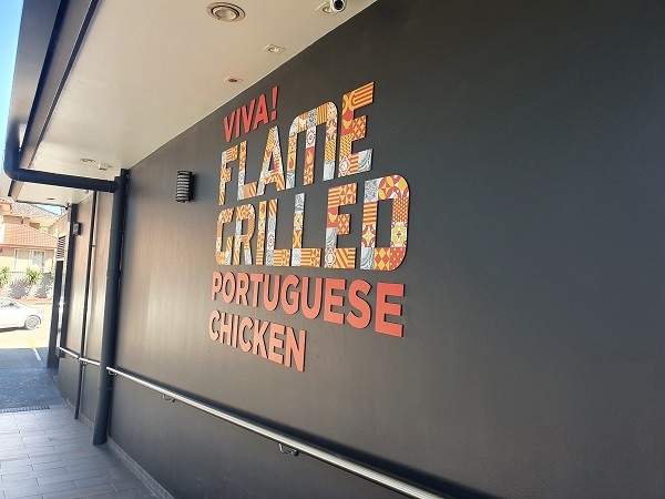
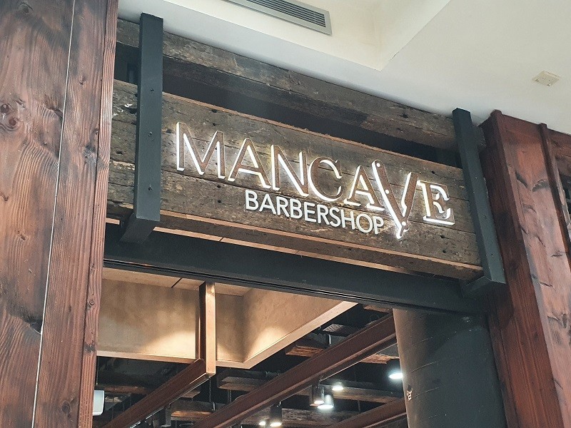
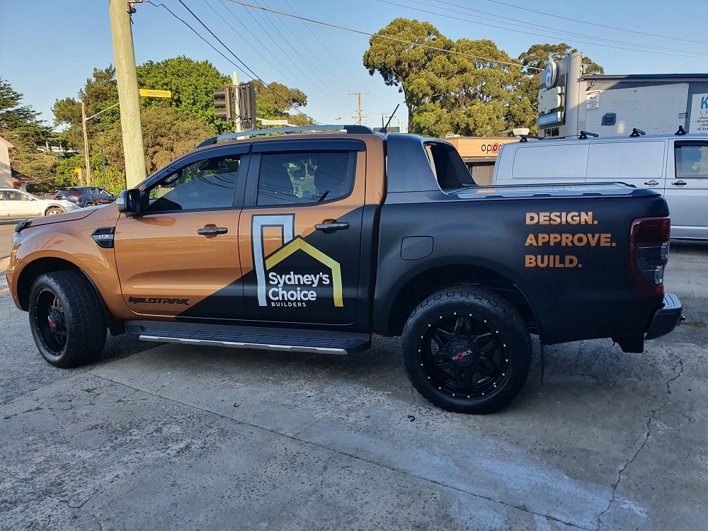
That is why effective retail signs in Sydney need to do more than display a business name. They need to be visible from the right direction, readable at an appropriate distance, and recognisable as part of the brand. Depending on the location, this could involve shopfront lettering, 3D signage, illumination, window graphics or a combination of different sign types.
The question is not how to make a shopfront as loud as possible. It is how to make it easier to notice, recognise and remember.
Why Retail Signage Matters for Sydney Stores
Think about signage from the customer's side of the street.
They may be looking specifically for the store. They might only know its name. Or they may have no intention of visiting until something catches their attention. In each situation, the shopfront has a job to do.
Good retail signage in Sydney can help a business:
- Establish a clear first impression
- Separate its storefront visually from neighbouring businesses
- Make its name easier to recognise
- Reinforce colours, typography and other brand elements
- Help customers identify the correct entrance
- Improve visibility to passing pedestrians
- Make the business easier to identify from the road
Context matters just as much as design. A sign that works on a quiet facade may disappear visually when placed among bright neighbouring storefronts, street furniture and other competing information.
Effective signage therefore needs to be designed for where it will actually be seen.
Different Signs Do Different Jobs
Not every sign on a retail property needs to perform the same function. A stronger storefront often comes from understanding what each signage element is supposed to achieve.
Shopfront Signs: Establishing the Store's Identity
The main shopfront sign usually carries the most important information: who the business is.
For shopfront signs in Sydney, readability should take priority over unnecessary complexity. Customers should not have to stop and study decorative lettering just to work out the store name.
Proportion also matters. The sign needs to suit the available facade rather than appearing squeezed into a small area or oversized for the building.
3D Signs: Creating Depth
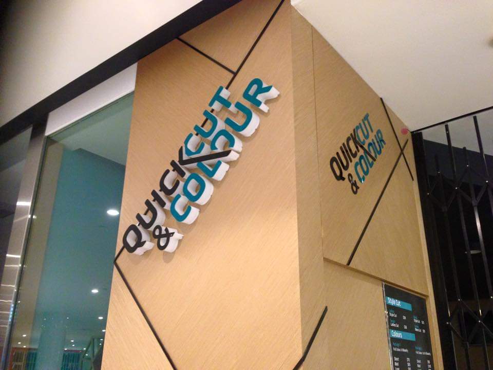
Flat graphics can be effective, but dimensional lettering introduces physical depth and shadow.
Well-designed 3D signs in Sydney can make a brand name or logo feel more integrated with the architecture of a shopfront. The effect can change throughout the day as natural and artificial light interacts with the raised elements.
The depth should still support readability. Dimension is most useful when it strengthens the design rather than becoming the design's only feature.
Illuminated and LED Signs: Staying Visible After Dark
A storefront that works well at midday may become much harder to identify in the evening.
This is where illuminated signs in Sydney can have a practical role. Lighting can help important branding remain visible when surrounding light conditions change.
The appropriate approach depends on the storefront, viewing conditions, and brand. Illumination should make information easier to see, not create glare or overwhelm the lettering itself.
Window Graphics: Using Existing Glass Space
Retail windows are valuable visual space.
Graphics can introduce branding, business information or decorative elements without requiring another large structure on the facade. They can also connect the windows visually with the main shop signs in Sydney retail locations used above or around the entrance.
Restraint is useful here. Filling every available centimetre of glass with text can make the storefront harder, rather than easier, to understand.
Building and Fascia Signs: Visibility at a Distance
Fascia and building signage can establish the store's presence within the wider streetscape.
Viewing distance becomes particularly important. Lettering that appears large when standing directly underneath the sign may be surprisingly difficult to read from across the street.
The available building space, surrounding architecture and likely customer approach should all project the design.
Directional and Wayfinding Signs: Finishing the Journey
Getting noticed is only the first step.
Customers may still need help finding an entrance, collection point, particular department or another area within a larger retail location. Directional and wayfinding signage can remove that uncertainty.
This signage should generally be simple. Once someone is actively looking for directions, clarity matters more than decorative complexity.
The Five-Second Street Test
One practical way to assess custom retail signs is to imagine a customer has only a few seconds to look at the storefront.
Can they answer these questions quickly?
What is the business called?
The primary business name should not compete with secondary information.
Can I read it from where customers actually approach?
Viewing distance and direction affect letter sizing and placement.
Does it look like the same brand I have seen elsewhere?
Colours, typography and logo treatment should remain consistent with the broader identity.
Where is the entrance?
Signage should not leave customers searching unnecessarily.
Is there too much information?
Phone numbers, service lists, slogans, opening hours and promotional messages can quickly turn a storefront into visual clutter.
Simple does not mean boring. It means creating a clear hierarchy.
Choosing the Right Material for Retail Signs
Material changes both the appearance and practical characteristics of signage.
Depending on the design and application, retail signs may incorporate materials such as acrylic, metal, and other suitable signage materials. The right choice depends on where the sign will sit, the desired visual effect, its size, and the surrounding environment.
Rather than selecting a material because it looks appealing in isolation, consider:
- Indoor or outdoor placement
- Exposure to weather
- Sign dimensions and weight
- Required finish
- Brand appearance
- Installation requirements
- Ongoing maintenance
- Compatibility with illumination, where applicable
Material and design should be decided together. Changing the material can significantly change how the same logo feels once produced at full scale.
Indoor and Outdoor Retail Signage Have Different Priorities
Outdoor signage has to compete with the street.
Visibility, environmental exposure, mounting, and changing light conditions all become important. The sign may also need to work from multiple viewing distances.
Indoor signage operates differently. Once customers have entered, branding can become more considered and detailed. Reception signs, wall graphics, directional signage, and branded elements can continue the identity established outside.
The strongest retail signage solutions should create continuity between these environments. The outside identifies the business, while the interior helps reinforce that identity and guide customers through the space.
How to Choose Retail Signs for Your Sydney Store?
Start by standing where your customers stand.
Do not begin with a catalogue of sign styles. Look at the actual storefront from across the road, from the footpath and, where relevant, from the direction of passing traffic.
Then consider:
- Primary visibility: What must customers notice first?
- Viewing distance: How far away will most people be when they first see the sign?
- Surroundings: What other signs, colours and structures compete for attention?
- Operating hours: Does visibility after dark matter?
- Brand character: Should the storefront feel bold, restrained, contemporary or dimensional?
- Available surfaces: Can windows, walls or fascia areas support the signage plan?
- Customer movement: Is additional directional signage needed after someone arrives?
These questions provide a stronger foundation for custom signage in Sydney than choosing a sign simply because a particular style looks impressive elsewhere.
Why Professional Sign Design and Installation Matters
A sign can look perfectly balanced on a computer screen and still perform poorly on a building.
Real-world signage involves scale, viewing angles, materials, fabrication, mounting surfaces, and installation. Each decision affects the next.
Professional commercial signage in Sydney should account for how a design moves from artwork to a physical object. Letter size needs to work with viewing distance. Materials need to suit the intended application. Mounting needs to be considered during design rather than after fabrication.
Installation is equally important. Alignment, spacing, and positioning can affect how professionally even a well-made sign appears.
This end-to-end thinking is particularly valuable for retail signs in Sydney, where the final product has to function within a busy real-world streetscape rather than an isolated design mock-up.
Make the Shopfront Easier to Recognise
Retail signage works hardest when it feels like a natural extension of the business rather than an afterthought attached to the building. Visibility gets people to notice the store, but clear branding and creative designs help them recognise what they have found.
Adverco provides exceptional signage design, production, fabrication and installation for businesses requiring business signs in Sydney and broader custom signage solutions. For retailers planning a new shopfront or updating existing signage, Adverco can help develop signage around the brand, site and practical requirements of the project.
Frequently Asked Questions
2. How can retail signs attract attention from the street?
Prioritise readable lettering, appropriate sizing, strong visual contrast, clear placement and simple messaging. A sign does not necessarily need more information to become more noticeable. Often, removing visual clutter improves recognition.
3. Are illuminated signs suitable for retail stores?
They can be particularly useful where the business needs to remain identifiable in lower-light conditions. The illumination style should suit the sign design, storefront, and overall brand presentation.
4. How do I choose the right size for a shop sign?
Consider how far away customers will be when they need to read it, the available facade space, surrounding visual competition and the amount of information being displayed. Sign dimensions should be assessed in relation to the actual location.
5. How much will a shop sign cost?
There is no standard figure that applies to every shopfront. Size, materials, design complexity, fabrication, illumination and installation requirements can all affect the project. A quote based on the actual signage requirements is more useful than a generic estimate.