- 26Oct
Wall graphics can look impressive in a design but disappointing once installed. The colours might not complement the furniture, the text might not be readable or the main piece of artwork might be obscured by a reception desk.
These problems usually begin when companies consider aesthetics and do not consider the use of the space.
When it comes to wall graphics in Sydney, successful design depends on clear messaging, interior compatibility and readable artwork. Commercial graphics should serve a purpose beyond decoration.
First, Decide What the Wall Needs to Communicate
Not every wall needs a company logo or motivational quote.
Visitors are met by a reception wall, which introduces your business. A retail feature wall can showcase products and graphics in a meeting room and can ensure brand identity without distracting the employees.
Before choosing artwork, determine the purpose of the wall.
| Commercial Space | Suitable Design Direction |
|---|---|
| Reception area | Company logo or brand statement |
| Retail store | Product imagery or promotional graphics |
| Corporate office | Brand values or company milestones |
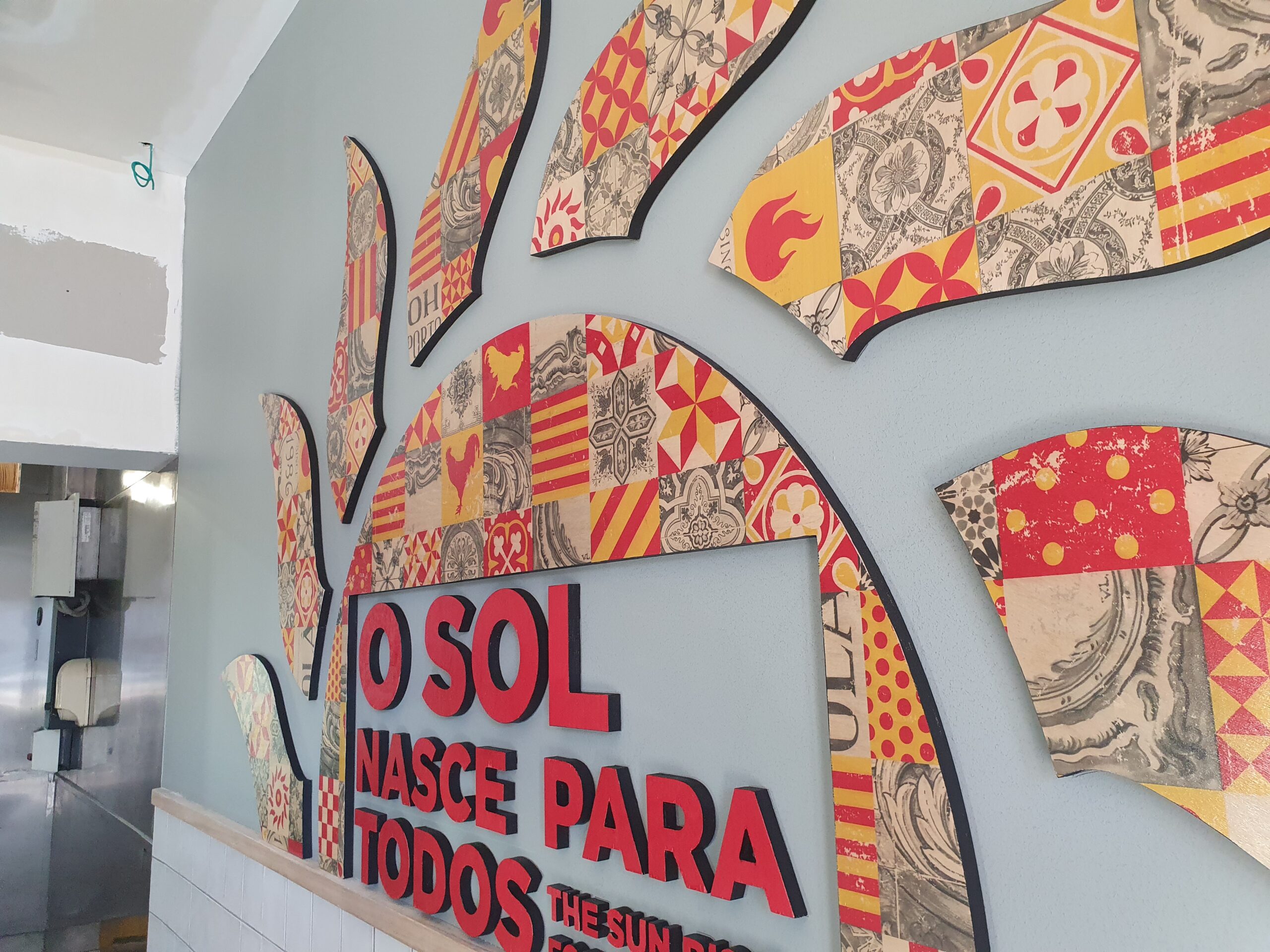
| Restaurant or café | Illustrations that complement the interior |
| Meeting room | Subtle patterns or minimal branding |
The clearer the purpose, the more easily the design elements can be chosen.
Five Design Decisions That Make a Difference
The most important thing for wall graphics is simplicity of artwork. Details of colour, scale and placement can make a world of difference regarding the overall design.
1. Keep Brand Colours Consistent
These colours should be used to shape the design, but not all the surfaces should be these colours.
For example, a company that has bright orange can use it for lettering or geometric designs but not necessarily on the entire reception wall.
This keeps the brand recognisable, but does not overpower the interior.
2. Make Typography Easy to Read
The font you use on your computer may be pleasing to look at, but hard to read from a distance, such as across a room.
Use legible lettering, high contrast and few messages.
If the visitor has to read all the words, the graphic could be too elaborate.
3. Match the Artwork to the Wall
There is a fine line separating the artwork that looks great in a big showroom, and that which looks great in a small hallway.
Consider the size of walls and doors, windows, shelving or furniture.
The work of art should be integrated with and not overwhelm these features.
4. Give One Element Priority
What should stand out as a visitor approaches?
It could be your logo, a product photo or a short statement.
Make sure it stands out and the supporting elements are subordinate. When everything is given the same look, there is too much noise.
5. Leave Some Breathing Space
Some empty space can improve the design.
In smaller-sized commercial areas important graphics can be emphasised by the use of well-placed spaces and simple backgrounds.
Design for the People Using the Space
Imagine a customer entering a shop.
First, they encounter a branded feature wall and then they move to product displays. The graphics should support their journey and not hinder the offering of the products.
Now think of an office reception desk. The wall can be observed from the entrance or waiting chairs, reception counter.
The design looks different from each viewpoint.
Before approval of a design, review:
- Whether important text remains visible above furniture.
- How lighting affects colours and readability.
- Whether the artwork looks balanced from various perspectives.
- The graphics are suitable for the environment around the interior.
- Doors and fixtures that can affect important design elements.
These checks are used to ensure that the appealing artwork is more functional and usable.
Think About the Wall Surface Too
The suitability of the design is also dependent on the surface to be integrated with.
Graphics for smooth walls may be different than for textured surfaces and rough finishes.
Businesses should make sure the surface is compatible before choosing materials or artwork.
Also, consider whether the graphic will be applicable in the future or whether it's a graphic that will need to be updated when the branding changes.
In businesses that are planning wall graphics in Sydney, these practical considerations are taken into consideration along with colours and images.
Create Walls That Reflect Your Business
Not all wall space has to be used for a successful wall graphic. It should communicate a message, fit in with the surroundings and strengthen the business's identity.
At Adverco Signs, we design, print and install custom wall graphics for commercial properties all over Sydney. We are able to help you discover designs to match your office, retail store or reception area. Give us a call at 02 9599 0006 to discuss your wall graphic requirements.